Tuesday, 10 April 2012

A Spring clean... and a new blog & website

We've been Spring cleaning! With all of this sun and showers, we've been inspired to update a few things round here and one of those things is our blog and website. 

All of the previous content is still available here but to find out what we've been up to since the beginning of April, please follow us to: 

https://businesstonik.wordpress.com/


Take a look and tell us what you think!


Monday, 20 February 2012

KanTeq: An example of why a brand is more than just a logo.

I'm constantly banging on about the difference between having a logo and having a brand. It's a common misconception and it amazes me how many people think they have a brand where in fact they have an identity, and sometimes not even that!

A great brand creates an experience and a journey. It sets up an expectation of what it will be like to deal with that company through its image, its voice and its marketing and then it delivers on that promise. And as a result of delivering on it, it gets people raving about it. A great brand is not just tangible, it should connect with it's audience emotionally.

I recently came across a great example of what a brand is all about which I wanted to share with you partly because it is a great example and partly because I think this particular company deserves some recognition. This company is KanTeq.


For those of you who don't know, I own a horse called Alfie. He's still a youngster but my aspiration is to compete with him. There's tons of kit to buy when you get your first horse and one of the most important choices you'll make is which body protector to invest in. There are lots on the market but one that particularly caught my eye was the Kan Body Protector. 

There is much talk on various horsey forums about this body protector (BP) with it being new to the market. Plus those who have one are raving about it. BP's are not a rider's favourite piece of gear but Kan wearers actually love wearing it!

I also liked the fact that it is geared towards women, being shaped in all the right places. So, I visited the website and this is where my customer journey began.

The Kan is not the cheapest BP on the market. It sits somewhere in the middle, being £235, but to my mind, you can't really put a price on a piece of safety kit. Afterall, this piece of kit might be responsible for saving my life one day! And besides, KanTeq do a good job of justifying their cost.

The website is very easy to get around and there is a lot of emphasis on the key differences of this product, including the fact that it is incredibly safe and incredibly comfortable. The company makes excellent use of third party testimonials, with many very genuine reports of how the Kan has worked, especially in the case of bad falls.

There is also great use of video both for customer testimonials and from Wendy McCaughan, the company's founder. Also, even though this is a safety item, you still want to look good wearing it. The fashion-style imagery helped create the right impression of how wearable this product is.


Every company needs a story and KanTeq has one. Wendy is extremely passionate about what she does and this comes across on the website, in the videos and on the phone when I called to discuss my order. Wendy spent time with me going through the best fit for me and went to great pains to convey how important it was that I was 100% happy with my purchase. This promise was then borne out when I found that I needed to have the fit altered having changed shape over the course of a few months. Wendy readily accepted the BP back, made the necessary changes and got the BP back to me quickly in time for an event. 

I know that it cost her to sort this out for me but she stated that it was more important that she had happy customers out there wearing her product as she saw this as the way forward to growing her customer base.

So, what makes KanTeq a great brand? Here's my checklist... how does your business compare?
  • The positioning is clear - designed by a woman for women
  • The proposition is unique - there is no other BP like it on the market
  • It is innovative - it uses technology not currently used in the equestrian industry
  • It has a clear visual identity - the logo is easily identifiable and the image is one of efficiency, reliability and technology (in colour psychology terms, the Winter colour palette is used which is entirely appropriate)
  • It instills confidence - through the image, the language used and testimonials
  • It has a story - we know how this company and product has come about, making us care
  • It creates a buzz - Kan wearers like to 'share the word' and tell others, creating loyalty
  • It delivers on it's promise - my experience has been everything I expected it to be
I had the opportunity to try out my Kan yesterday. I can confirm that it really is extremely comfortable and stylish. Fortunately, I didn't need to experience its safety credentials!


Thursday, 2 February 2012

A win in the Annual Design Awards for third year running

Every year printing.com runs their Annual Design Awards. Open to over 200 creative agencies across the UK, the competition provides an opportunity for the 'best of the best' to be recognised for their creative services.

We always enter and we always come up tops and this year was no exception.


I am very pleased and proud to announce that Oliver came 2nd in the 'Prestige' category with his booklet design for Amy Karim of Crystal Bridal Accessories and 1st place in the 'Seasonal' category for his voucher card design for Rachel Hague of The Schoolrooms.


It's fantastic to be recognised for our design offering but even better is to hear the feedback our clients give us. Interestingly, a recurring theme in the work that gets the most accolades is that the client invests realistically in the design time and allows us creative freedom to produce what we believe will work best. 

1st place - 'Seasonal' for The Schoolrooms Butchery~Deli~Cafe

"I'm really pleased to hear that my voucher card has won this award. I enjoy working with the Sheffield printing.com team because they make things easy for us. I am very busy and often will provide a loose brief of what I'm looking for but then leave it to the team to come up with the solution. They understand our brand ethos and what we are trying to achieve and their designs interpret this perfectly. Importantly, what they do actually helps us to win business. The voucher card was a success, it brought in people and this meant more sales. We will definitely be running this campaign again next year!" Rachel Hague, The Schoolrooms


2nd place - 'Prestige' for Crystal Bridal Accessories

"I am ecstatic with the results of the style guide brochure – it is professional, high quality and very well-designed. The design process itself was stress-free and I was impressed with the way all our ideas, thoughts, likes, dislikes were discussed so that the end product reflected our image perfectly! We were given detailed information about paper types, styles and finishes which helped us to make the right decision about the look of our final brochure. Thanks for an excellent service and a beautiful brochure. We will definitely be recommending you to all our colleagues in the industry." Amy Karim, Crystal Bridal Accessories


 What a fantastic start to 2012, don't you think?!


We love to design... An e-booklet for a Sheffield events company


There's no denying that online approaches to marketing are evermore popular and so often I hear that offices are going 'paperless' and sending out less printed materials. Whilst I'd argue that printed materials should have their place in the overall marketing strategy, that debate is for another article entirely.

Whether you're printing or online, one things for sure - you should still invest in great design. If you're trying to win work, the impression you make counts and certainly, poor design will only create a hurdle that none of us need in current times.

One company that understands this is Speakers from the Edge. This seriously driven company organises inspirational speakers for events, with those speakers consisting of explorers, mountaineers, adventurers... people who are amongst the most inspirational you are ever likely to listen to!

Directors Rebecca Varley and Kerry Galvin approached us to discuss how best to develop the corporate side of their business. More often than not, when approaching businesses, they were being asked to email information but were coming up against large file sizes and attachments. People are never keen to receive large PDF's and often firewalls will stop the email coming through, remove the attachment or put the email into junk... all bad.

So, our solution was to design and publish an e-booklet which would provide a link that could be pasted into an email or added to the website to download.


Oliver worked through three different creative approaches for Rebecca and Kerry to choose from:


And then once they'd chosen, the style was applied to the whole booklet. The e-booklet is completely interactive, easy-to-use and allows click-throughs to the website, emails, links and so on. Importantly, it can also support the printed article as the same files are used. This means that you're covering all bases. Not everyone wants something in the post and not everyone is happy with just an email. Personally, I find doing both makes the biggest impact.

My photography doesn't do this project justice so to view the live e-booklet, take a look at the following link: Speakers From The Edge e-booklet


I think the crucial thing with this project is that Rebecca and Kerry gave Oliver his head with the design. Whilst he still worked within the brand constraints, having understood the brief Oliver had free rein over the approach and as a result, Speaker's had three highly creative, unique and eye-catching approaches to choose from and a final result that will, we have no doubt, help Speakers from the Edge to win the clients that they want.

"We came to talk to printing.com Sheffield about a new innovative way to market our motivational speakers to potential clients. We wanted a fresh, eye-catching and interactive way to engage our clients that would complement our existing website and drive traffic to it. Given their marketing know-how, we asked the team for their advice, and they suggested designing an e-booklet.

The team were extremely enthusiastic and totally understood our brief. The entire process, from concept to design through to the final product was expertly driven by the team. We now have a stylish, fully interactive and user-friendly e-booklet which is central to our marketing strategy. As always, printing.com Sheffield were a pleasure to work with and we would highly recommend this particular service to any company looking to grow their business."


Wednesday, 25 January 2012

We love to design... a retro design for an accountancy firm near Sheffield

Opposite this post you'll see that I recommend my 'straight-talking accountant', Robert Tippett of Leesing Marrison Lee & Co.

I thought I'd write a quick post on a little project we've just completed for them to advertise their new referral scheme. Robert, like many of our clients, wanted us to 'just put something together' for them. So, we came up with a little concept which we think will help grab the attention of his clients.

So often I see the professional services opting for the same old, same old... pictures of people in suits, the stereotypical 'shaking hands', the boring 'we're serious about business' blue. I wanted Robert's promotion to look different because Robert isn't your stereotypical accountant (this being a good thing!).

So, we went for a retro, tongue-in-cheek approach. Retro is all the rage at the moment and I know that the theme isn't new but I think this is the best approach to getting the promotion noticed against the usual paperwork that you get through from your accountant. And I don't think it ever does any harm to inject some humour into your marketing, so long as it doesn't undermine the professionalism of the company.

So here's a couple of pictures of the flyer, produced on a high gloss finish for maximum impact. Simple but effective, I'm sure you'll agree:


I'm very pleased with how they look and I'm looking forward to finding out how the campaign works for Robert. And of course, if you decide to use Robert's services once you've read this post, make sure you tell me because I'll be onto Robert for my commission!

Sarah


Wednesday, 4 January 2012

The diary of a new brand... Part 1


I've committed a heinous crime. The crime of not updating my blog. I've neglected it for nearly 2 months and have come back to it to find it smelly, stale and in need of some tender loving care. But here's my excuse....


We are in the middle of launching a new brand... for ourselves. We have for some years now delivered a high standard of design and for many of our clients we also provide logo design services, copywriting, web design and marketing support but we do feel we're hiding our light under a bushel, so to speak!

We know that we're only delivering half of the solution when it comes to launching a successful brand for our clients but we also know that to attract the right projects and instill confidence in our abilities, we've got to re-position ourselves. Don't get me wrong, the printing.com side of our business will continue to run as it alway has but as with any good business, we also recognise the need to adapt and change.


And so, I think that there's value in me sharing with you our journey, in anticipation of our new brand's eventual launch.

So, what does it take to launch a new brand? Well, there are in my experience and opinion a number of steps to be taken:

1)
Identify an opportunity or gap in the market - is there actually space for you or do you need to create that space?

2) Establish what your brand will represent - what are your core values, your core purpose and business model? Write this all down and share it with your team as your brand, crucially, starts from the inside.

3)
Position yourself - who are your potential customers, your competitors and how will you differentiate yourself?

4) Identity - what will your brand name be? What will your logo look like? What will your corporate identity look like? Does the look, feel and colour palette convey the right message to the customers you wish to attract?


5) Communication - internally, how will you ensure that your company lives the brand? Externally, how will you market your brand?

6) Delivery - a brand only grows if the promise it makes is delivered on. How will you ensure this happens and how will you measure it?

I'm pleased to say that we are now at stage 4 of this process but boy, has it been a tricky journey so far!

So, what do you think so far of our plans? And what do you think it takes to launch a successful brand? I'd love to hear your thoughts.

Keep  checking back to learn more about how we've approached each stage and for the final unveiling....


Tuesday, 25 October 2011

We love to design... a slick look for a start-up training company

We love to work with start-up businesses. We find that start-up's get the most out of our services because they recognise that our input can add value and they tend to trust our judgement. Start-up businesses are also a sponge for information and expertise and it can therefore be very energising working with them.

Gemma and Anita of Global Hair Training were no exception to this. Having just launched a hair training company through which to deliver their own extensive expertise, they needed an eye-catching, slick and professional image to roll out their company. As with many start-up's, budgets were tight but this never changes the standard of the final results - we just ask the client to do a bit more of the legwork than normal!

Oliver started off by creating a simple and low cost logo. The ladies gave us a rough idea of what they had in mind and we created is graphically so our creative input was hugely reduced, thus minimising costs in this area. However, even a quick job by us looks hugely professional!


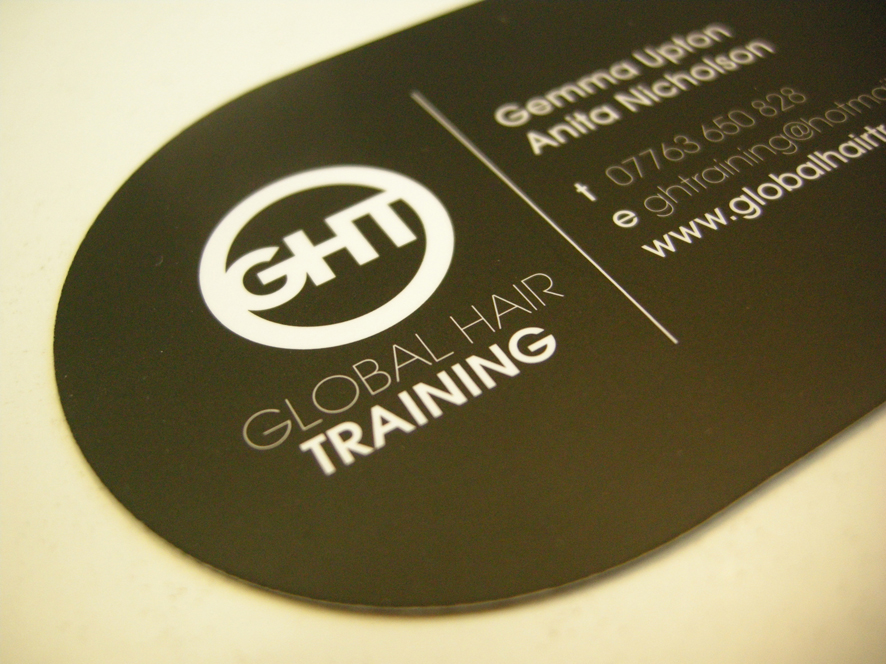
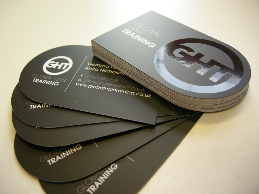
Gemma and Anita really liked the idea of a shaped card with spot UV for maximum impact. By using an offer on our StarMarque business cards coupled with a voucher for free shaping, we managed to get the most out of the budget allocated to the cards. The cards look fantastic and the ladies are getting a lot of attention and positive feedback from them.


We then sent Gemma and Anita off to get together the content for their hand-out and to source imagery. They did a great job of selecting images that really enhanced the overall look.


The final stage of the project was their website. The brief was to create a website that would create an online 'shop front' that hairdressers and the like could go to, off the back of the business cards and hand-outs, to find out more about Gemma and Anita and the courses they are running. With a tight budget, we had to come up with quite a few work-arounds, including PDF click-through's rather than link pages.

The site is a simple solution and whilst it is not intended to drive business (since it is not SEO'd), it does provide an excellent solution for the stage that GHT is at currently.


We weren't the first choice for GHT, as the following feedback shows, but we think that Gemma and Anita are pleased they found us in the end:


"We were originally recommended to use printing.com by a friend but, thinking that all printing.com's were the same, made the mistake of going to a store closer to us. We had our meeting but felt that our ideas weren't taken seriously and no feedback was given so we approached the team originally recommended in Sheffield. We found them very approachable and we had a number of meetings with them in which they gave us great ideas to promote our business. The design was fantastic and we've had lots of positive feedback about the business cards, hand-outs and website, all of which have a very professional look and feel."
 

Thursday, 22 September 2011

Are you missing key opportunities to win more business?


Considering how tight cash is these days, I continue to be amazed at how sloppy many businesses are when it comes to winning business. Let me give you a couple of examples.


Last year, when we were looking for someone to carpet our house, we put the opportunity to two local businessmen. Both visited the house. One supplied a quote instantly. The other procrastinated... and procrastinated... finally supplying his price after the job has been done and dusted! 

My second example is a company that we subcontract to from time to time. It's taken no less than four phone calls to place an order and I'm still chasing them up to get the order moving so that our client receives their goods on time! It's infuriating me and it goes without saying, we won't be using them again.

So, are you doing everything possible to win your share of the business out there?

Here are my 5 top tips on those fundamental things that you should be doing in your business to up your chances.


Answer your phone in a professional manner
.
How your business number is answered forms the first impression that a potential client will have of your company. Sloppy answering means sloppy company as far as I'm concerned! It should be clear to the caller that they've reached the correct company and who they're speaking to. On this topic, if you can't always answer the phone, be sure to have an answer machine with a professional, recorded message and it is good practice to respond within 4 hours. Better still, use a remote PA service (I can put you in touch with a few).


Build a database
.
How many times have you called a business to ask for a price but not been asked for any contact details? Building a database of enquiries and clients is crucial to business growth and frankly, if you're not going to take details,
you might as well chuck your marketing budget in the bin! Without contact details you can't follow up, you can't market ongoing and you can't build a relationship with your client base. There are plenty of excellent CRM (Customer Relationship Management) systems out there but even Excel will do the job on a smaller scale.

Provide a price promptly.
I'm a big believer that the way you do business before you've won the order is a good indication of how you'll handle the contract once you've won the order. Be prompt and efficient and above all, don't wait to be chased up! I'm aware that there's a school of thought that advocates appearing not to need the work in order to add more value to what you do but I personally think that this is a risky approach to take. I think that sloppiness at this stage just demonstrates that you're disorganised and will likely carry through to the entire order process. That's just my opinion but also my experience.


Follow up
.
You wouldn't believe how much work we win because we bother to follow up our enquiries. It's not always about price. Sometimes people just want to work with people who want their work and being keen to win the job demonstrates that you'll fulfil it to a high standard. Really, this is just the final stage of the standard sales process - closing. Asking for the order is the thing that many people struggle with but is most likely to secure the sale. What's more, following up allows you to handle any objections or concerns about moving forward.
 

Deliver on your promises.
It sounds obvious but if you don't do what you say you will, when you say you'll do it by, you'll be unlikely to secure further work. Printing.com has a fantastic guarantee - it's on time or it's on us - and boy, does it keep our service sharp. What type of guarantees could you implement into your service delivery? And what processes do you need in place to ensure you stick to those guarantees? The key elements of my business are communication, project management and traceability of the order and from the feedback I receive, we don't let our clients down. This is all part of growing a trusted brand.


These things are just the tip of the iceberg when it comes to growing your business but in my experience are some of the most crucial things.

Why not stand back from your business for a moment and assess whether you've got the basics in place? It could make all the difference.


Friday, 9 September 2011

We love to design... an elegant new brochure for a bridal accessories company


I think it's time I updated you with what we've been up to in the design studio this month!

We've recently completed a project for fabulous bridal accessories company, Crystal Bridal Accessories. Crystal is owned and run by the very driven and focused Amy Karim. 

Amy clearly has her finger on the pulse when it comes to ideas for accessorising your wedding outfit and I love the way that she's approached her business as a fashion advice resource. Often it can be difficult for people to visualise what should go together or how to create a particular look but Amy has made this easy for her customers, with lots of advice, imagery and a blog. I particularly love the vintage-style accessories and looks, evoking art deco imagery.

Amy was keen to bring a selection of her products and inspiration together into an elegant brochure which customers could purchase as a handy guide to creating their perfect wedding outfit. 

Amy was fantastic to work with, providing a clear vision of how she wanted her brochure to look but allowing us to have our creative input and responding to advice in a way that allowed us to add real value to the project.

Amy opted for a square format with silk inner pages and a matt laminated cover, which adds to the elegance and finesse of the finished brochure. We were given beautiful, professional photos to work with (half the battle won in a product brochure!) and Amy provided visuals of where we were heading. It was then up to us to realise her vision. Amy had this fantastic feedback for us:

"I am ecstatic with the results of the style guide brochure – it is professional, high quality and very well-designed. The design process itself was stress-free and I was impressed with the way all our ideas, thoughts, likes, dislikes were discussed so that the end product reflected our image perfectly! We were given detailed information about paper types, styles and finishes which helped us to make the right decision about the look of our final brochure. Thanks for an excellent service and a beautiful brochure. We will definitely be recommending you to all our colleagues in the industry."


Thank you Amy! It was great to work with you and we are equally pleased with the results!

Check out Amy's site (www.crystalbridalaccessories.co.uk) and tell your friends about her, especially if they're planning their wedding or have a special occasion coming up. And order your own Bridal Accessories Style Guide before they sell out!

Inspiration and direction

A simple cover using elegant typography
Clear instructions on how to order
Eye-catching headlines that categorise the range
Magazine style spreads that offer fashion advice
Individual styling for each page
Clear contact details to drive website traffic
 

Monday, 5 September 2011

Marketing advice for a fashion label

If you've read my previous posts, you'll know that I love Dragon's Den. I'm finding that it's a great source of inspiration for this blog and Sunday's episode was no exception.

There's always lots of discussion about the strength of a company's brand and this week, the focus was on cult fashion label Brat & Suzie.

The label is headed up by twins Polly & Charlotte Vickery, who braved Dragon's Den to pitch for investment to grow their business.

The twins are lovely - very cute, very quirky, very driven and pretty damn persuasive. There's no doubting that their clothes range is unique and I shall definitely be making (a few!) purchases.


But what was painfully missing was a visible identity and brand. 

Polly and Charlotte appeared in Dragon's Den with just a clothes rail and wearing items from their range.

There was no corporate identity, no marketing materials, nothing to remind you of their name. In fact, I missed their name at the beginning of their pitch and only found it out when they explained that the name came from
their kittens when they were kids - quirky but befitting considering their range features animals.


They clearly have a unique product, especially judging from the amount of magazine coverage they've achieved. The problem is that the twins are the company and without a strong brand to carry their ethos, story and personality, I don't see how they can scale up their operation.

So, this would be my advice to Brat & Suzie: 

Invest in a unique logo.
It can be tough when you're working on a budget but I passionately believe that it's essential to invest in a unique identity that has been designed specifically for your company. No free fonts, no matter how great they are these days - anyone can use them and this doesn't bode
well for differentiating your identity.

Create an eye-catching corporate identity.
The illustrations that Brat & Suzie use are so stunning and kitsch, I find it amazing that they didn't enter the Den with visuals that would demonstrate their identity. How about clothes labels, banners, postcards? They could have given each Dragon a little branded package of goodies which would really have emphasised their message. Unfortunately, even the clothes rail was pretty uninspiring in its presentation and did little to promote the fabulous range of designs.


Build a compelling brand.
There's a story behind Brat & Suzie and you warm to the girls instantly. However, there seems to be little out there about the girls and the website does little to draw attention to the story with just an 'about us' link at the bottom of the page which I missed several times. Girls! Let us in on who you are and what you're about so that we can buy into your vision, not just your clothes! 

As I'm writing this I'm wondering if I've missed the point - maybe it's cool to be so invisible, maybe that's what makes it 'cult' - but then why appear on Dragon's Den looking to expand?

That said, what better coverage can you get? Maybe this is just the start of their strategy for expansion and according to reports, their website crashed during the show so at least now they're getting the attention they deserve. Now I'm off to get me a Victorian Rabbit Top!


Wednesday, 24 August 2011

Why free design is bad news for your business

Times are tough, there's no secret about that. And with tighter and tighter budgets, it can be tempting to look at ways to cut corners. The lure of free design is a tempting proposition and one we often find ourselves up against but here's why I think it's damaging for your business.

Something has to give.

I passionately believe that when design is 'free', something has to give. When someone isn't making money from something, how much effort will they be putting into your design? And remember, a great design is crucial to a piece of print working. If the design doesn't communicate your offering in the right way
, you'll be reducing your chances of a response. Do you think someone doing free design for you will be giving your company the consideration and time it deserves?

Who takes the hit in the end?

Along the theme of 'something has to give', money has to be made somewhere. If the designer is also producing the print for you, and they're doing the design for 'free', then the profit has to be in the print and this can often mean cheap, flimsy papers and cards. Think about the impression you'll be giving of your business if you hand out cheap business cards featuring a shoddy design at your next networking event (Vistaprint, anyone?).


Get to the back of the queue!

How long are you prepared to wait? If there's no money in it for the designer, how likely are they to prioritise your job? Chances are they'll stick you way behind the people who are paying or they'll have so much on because they're working for free, you'll be waiting a long, long time for a piece of sub-standard design work. You'll likely lose more money waiting to get your marketing out than you would have paid to have a professional design produced!


A false ecomony
.
On a practical level and in our experience, companies who give away their services for free are rarely around in years to come. This can often mean that your design files, or even your website, can disappear with them. On this point, a company that has longevity must be doing something right in their own business. Taking note from successful suppliers can do wonders for your own!


Give your company the attention it deserves
.
Why use someone to produce design for your business who undervalues their own service so much that they'll give it away for free?! You have to question a designer who is having to give away their service in order to win work. Or maybe they simply don't have confidence in their own skills. The cost of a designer often reflects their skills and knowledge. Pay nothing and you're likely to get nothing of value in return. Invest in your business and you'll see the return.

"If you think it's expensive to hire a professional to do the job, wait until you hire an amateur."    Red Adair, American Oil Well Firefighter

Friday, 12 August 2011

7 tips for achieving your goals


I finally bought my horse this week.

This has been a lifelong dream and my main motivation for being self-employed since I figured I'd have better control over what I can earn and what hours I work - both useful prerequisites of horse ownership!

What is interesting about achieving this life goal this year is that when I wrote down this year's personal goals at the start of the year, buying a horse was on that list. In fact, throughout my life, my lists have lead to me buying my first car, buying my house, buying my business... so on and so forth.

So, what is it about the power of the written word when it comes to achieving your goals?

A recent study conducted by the Dominican University supported the positive effect of written goals: those who wrote their goals down accomplished significantly more than those who did not write their goals. 

So, here are my 7 tips on goal achievement:

1. Write down your goals - this makes them tangible and real and helps provide focus.

2. Tell your friends and family about your goals - this creates accountability and you'll be more inclined to provide updates on where you're up to which is hugely motivational.

3. Break each goal down into manageable chunks - a big goal can be overwhelming and might only be achieved through other smaller goals being achieved. Work it back to achieving the smaller goals and the overall goal tends to happen organically.

4. Make your goals SMART - that's specific, measureable, agreed, realistic & time-based. Just writing down a list of your life's desires will not always turn into reality (although it still increases your chances) but planning each goal in detail will help with point 3.

5. Create visible reminders of your goal - if you're a procrastinator like me, you'll need visual prompts to motivate you. I've had a picture of me riding as my laptop screen background which has triggered conversation with clients about why it's there!

6. Review your goals regularly - maybe once a quarter to see how you're getting on and to make any neccesary changes to the grand plan.

7. Tell everyone once you've achieved your goal - you'll find people will celebrate in your achievement and crucially, it is also self-affirming to acknowledge that you have achieved yet another one of your goals!


So, with this in mind, here's a picture of my beautiful boy... all I need to do now is set another goal that will allow me to afford his huge food bills!!!


Monday, 8 August 2011

A strong brand is what?!!

I love Dragon's Den. It's a great mixture of entertainment, inspiration and, let's face it, self-efficacy!

I was especially intrigued this week by Evan Davis's summary of a strong brand being 'more than just a logo, it's a whole visual identity'. I know, I'm being picky - he was using this as a lead on to the three popcorn chaps - but my instant reaction was 'that's not what a strong brand is all about'!

He is, of course, not the first to get confused about the differences between a logo, a corporate identity and a brand. It's a potentially confusing topic, especially as many people hope they have a brand, but rarely do.

So, let's iron this out simply.

A logo is an icon, symbol or font style that represents your business in it's simplest form.


A corporate identity is the visual aspects that represent the brand, such as letterheads, signage and packaging.


A brand is an emotion or gut instinct about the company. Your brand is not what you think it is but what your audience's perception is.

HEALTHY... FRESH... TASTY... FUNKY... DESIRABLE... SUSTAINABLE... ETHICAL... FOCUSED...

Creating a strong brand does include an effective logo and it does include a fantastic corporate identity but the brand is driven by ensuring that everything that the company does, says and projects fulfils the values, aims and ethos of the overall business. 


It therefore goes without saying that you won't have a strong brand without planning at a strategic level. This planning will drive the 'promise' of the company, which is often communicated through the company's mission statement which will in turn drive everything about the way the business conducts and communicates itself - both internally and externally.

Crucially, a brand will only grow strong when the 'promise' is consistently delivered on.


So, do you have a brand? Do you know what people think of your company and does this match with what you want them to think of your company? And if not, do you know what to do to change perceptions?

Having a strong brand reduces the need to compete on price because your market comes to you rather than you chasing them. I'd say that alone makes it well worth the investment in time, funds and headspace!


Credit goes to Innocent Drinks for the use of their logo etc. to illustrate what a great brand is all about!

Monday, 25 July 2011

Are you making enough of an impact?

It's tough getting noticed these days. We're bombarded with thousands of marketing messages on a daily basis and whilst you may have something great to sell, getting people to sit up and take notice can be difficult.

One way of getting your message noticed is to choose a finish or shape for your promotional literature that catches people's attention and encourages people to hold onto your literature for longer than average, giving you a better chance of your message being read.

Of course, this isn't the complete answer. Your message and copy must be compelling. It must answer that age-old question of 'what's in it for me?' and you must instil confidence in the reader, usually through the use of testimonials. Crucially, you must also include a 'call to action' so the reader knows what to do with the information if it's of interest to them!

But back to that interesting finish or shape....
I thought it might be useful to share with you some of the ways that we have created a more unusual piece of marketing that moves away from the typical flat leaflet or flyer and therefore works a lot harder as a piece of print.

No more stuffing letterboxes... just hang it on their door!
Create a pretty and interesting shape to complement the design
(design courtesy of Charlotte Thomson Art & Illustration)
Want them to keep hold of your brochure? Create quality with high gloss
Grab attention with an interesting shape and shiny bits!
Draw the eyes with elegant gloss highlights
Launch party invite? Make them feel special with something to keep
Shaped and starmarqued for maximum impact
Give your clients' a voucher to keep hold of at Christmas
Excellent use of Spot Uv on a corporate business card
Quirky use of shaping on a flyer that people can play with!
Brochure and folded business card all in one

I think these examples show perfectly how a printed piece of marketing can make an impact in a way that is difficult to replicate via email or web... you've just got to be creative about how you use a piece of card!