Tuesday 25 October 2011

We love to design... a slick look for a start-up training company

We love to work with start-up businesses. We find that start-up's get the most out of our services because they recognise that our input can add value and they tend to trust our judgement. Start-up businesses are also a sponge for information and expertise and it can therefore be very energising working with them.

Gemma and Anita of Global Hair Training were no exception to this. Having just launched a hair training company through which to deliver their own extensive expertise, they needed an eye-catching, slick and professional image to roll out their company. As with many start-up's, budgets were tight but this never changes the standard of the final results - we just ask the client to do a bit more of the legwork than normal!

Oliver started off by creating a simple and low cost logo. The ladies gave us a rough idea of what they had in mind and we created is graphically so our creative input was hugely reduced, thus minimising costs in this area. However, even a quick job by us looks hugely professional!


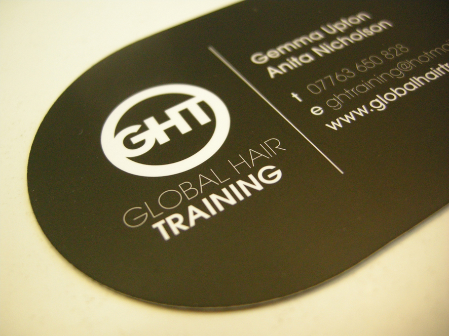
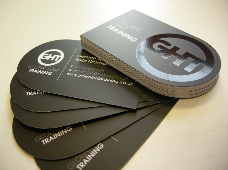
Gemma and Anita really liked the idea of a shaped card with spot UV for maximum impact. By using an offer on our StarMarque business cards coupled with a voucher for free shaping, we managed to get the most out of the budget allocated to the cards. The cards look fantastic and the ladies are getting a lot of attention and positive feedback from them.


We then sent Gemma and Anita off to get together the content for their hand-out and to source imagery. They did a great job of selecting images that really enhanced the overall look.


The final stage of the project was their website. The brief was to create a website that would create an online 'shop front' that hairdressers and the like could go to, off the back of the business cards and hand-outs, to find out more about Gemma and Anita and the courses they are running. With a tight budget, we had to come up with quite a few work-arounds, including PDF click-through's rather than link pages.

The site is a simple solution and whilst it is not intended to drive business (since it is not SEO'd), it does provide an excellent solution for the stage that GHT is at currently.


We weren't the first choice for GHT, as the following feedback shows, but we think that Gemma and Anita are pleased they found us in the end:


"We were originally recommended to use printing.com by a friend but, thinking that all printing.com's were the same, made the mistake of going to a store closer to us. We had our meeting but felt that our ideas weren't taken seriously and no feedback was given so we approached the team originally recommended in Sheffield. We found them very approachable and we had a number of meetings with them in which they gave us great ideas to promote our business. The design was fantastic and we've had lots of positive feedback about the business cards, hand-outs and website, all of which have a very professional look and feel."
 

Thursday 22 September 2011

Are you missing key opportunities to win more business?


Considering how tight cash is these days, I continue to be amazed at how sloppy many businesses are when it comes to winning business. Let me give you a couple of examples.


Last year, when we were looking for someone to carpet our house, we put the opportunity to two local businessmen. Both visited the house. One supplied a quote instantly. The other procrastinated... and procrastinated... finally supplying his price after the job has been done and dusted! 

My second example is a company that we subcontract to from time to time. It's taken no less than four phone calls to place an order and I'm still chasing them up to get the order moving so that our client receives their goods on time! It's infuriating me and it goes without saying, we won't be using them again.

So, are you doing everything possible to win your share of the business out there?

Here are my 5 top tips on those fundamental things that you should be doing in your business to up your chances.


Answer your phone in a professional manner
.
How your business number is answered forms the first impression that a potential client will have of your company. Sloppy answering means sloppy company as far as I'm concerned! It should be clear to the caller that they've reached the correct company and who they're speaking to. On this topic, if you can't always answer the phone, be sure to have an answer machine with a professional, recorded message and it is good practice to respond within 4 hours. Better still, use a remote PA service (I can put you in touch with a few).


Build a database
.
How many times have you called a business to ask for a price but not been asked for any contact details? Building a database of enquiries and clients is crucial to business growth and frankly, if you're not going to take details,
you might as well chuck your marketing budget in the bin! Without contact details you can't follow up, you can't market ongoing and you can't build a relationship with your client base. There are plenty of excellent CRM (Customer Relationship Management) systems out there but even Excel will do the job on a smaller scale.

Provide a price promptly.
I'm a big believer that the way you do business before you've won the order is a good indication of how you'll handle the contract once you've won the order. Be prompt and efficient and above all, don't wait to be chased up! I'm aware that there's a school of thought that advocates appearing not to need the work in order to add more value to what you do but I personally think that this is a risky approach to take. I think that sloppiness at this stage just demonstrates that you're disorganised and will likely carry through to the entire order process. That's just my opinion but also my experience.


Follow up
.
You wouldn't believe how much work we win because we bother to follow up our enquiries. It's not always about price. Sometimes people just want to work with people who want their work and being keen to win the job demonstrates that you'll fulfil it to a high standard. Really, this is just the final stage of the standard sales process - closing. Asking for the order is the thing that many people struggle with but is most likely to secure the sale. What's more, following up allows you to handle any objections or concerns about moving forward.
 

Deliver on your promises.
It sounds obvious but if you don't do what you say you will, when you say you'll do it by, you'll be unlikely to secure further work. Printing.com has a fantastic guarantee - it's on time or it's on us - and boy, does it keep our service sharp. What type of guarantees could you implement into your service delivery? And what processes do you need in place to ensure you stick to those guarantees? The key elements of my business are communication, project management and traceability of the order and from the feedback I receive, we don't let our clients down. This is all part of growing a trusted brand.


These things are just the tip of the iceberg when it comes to growing your business but in my experience are some of the most crucial things.

Why not stand back from your business for a moment and assess whether you've got the basics in place? It could make all the difference.


Friday 9 September 2011

We love to design... an elegant new brochure for a bridal accessories company


I think it's time I updated you with what we've been up to in the design studio this month!

We've recently completed a project for fabulous bridal accessories company, Crystal Bridal Accessories. Crystal is owned and run by the very driven and focused Amy Karim. 

Amy clearly has her finger on the pulse when it comes to ideas for accessorising your wedding outfit and I love the way that she's approached her business as a fashion advice resource. Often it can be difficult for people to visualise what should go together or how to create a particular look but Amy has made this easy for her customers, with lots of advice, imagery and a blog. I particularly love the vintage-style accessories and looks, evoking art deco imagery.

Amy was keen to bring a selection of her products and inspiration together into an elegant brochure which customers could purchase as a handy guide to creating their perfect wedding outfit. 

Amy was fantastic to work with, providing a clear vision of how she wanted her brochure to look but allowing us to have our creative input and responding to advice in a way that allowed us to add real value to the project.

Amy opted for a square format with silk inner pages and a matt laminated cover, which adds to the elegance and finesse of the finished brochure. We were given beautiful, professional photos to work with (half the battle won in a product brochure!) and Amy provided visuals of where we were heading. It was then up to us to realise her vision. Amy had this fantastic feedback for us:

"I am ecstatic with the results of the style guide brochure – it is professional, high quality and very well-designed. The design process itself was stress-free and I was impressed with the way all our ideas, thoughts, likes, dislikes were discussed so that the end product reflected our image perfectly! We were given detailed information about paper types, styles and finishes which helped us to make the right decision about the look of our final brochure. Thanks for an excellent service and a beautiful brochure. We will definitely be recommending you to all our colleagues in the industry."


Thank you Amy! It was great to work with you and we are equally pleased with the results!

Check out Amy's site (www.crystalbridalaccessories.co.uk) and tell your friends about her, especially if they're planning their wedding or have a special occasion coming up. And order your own Bridal Accessories Style Guide before they sell out!

Inspiration and direction

A simple cover using elegant typography
Clear instructions on how to order
Eye-catching headlines that categorise the range
Magazine style spreads that offer fashion advice
Individual styling for each page
Clear contact details to drive website traffic
 

Monday 5 September 2011

Marketing advice for a fashion label

If you've read my previous posts, you'll know that I love Dragon's Den. I'm finding that it's a great source of inspiration for this blog and Sunday's episode was no exception.

There's always lots of discussion about the strength of a company's brand and this week, the focus was on cult fashion label Brat & Suzie.

The label is headed up by twins Polly & Charlotte Vickery, who braved Dragon's Den to pitch for investment to grow their business.

The twins are lovely - very cute, very quirky, very driven and pretty damn persuasive. There's no doubting that their clothes range is unique and I shall definitely be making (a few!) purchases.


But what was painfully missing was a visible identity and brand. 

Polly and Charlotte appeared in Dragon's Den with just a clothes rail and wearing items from their range.

There was no corporate identity, no marketing materials, nothing to remind you of their name. In fact, I missed their name at the beginning of their pitch and only found it out when they explained that the name came from
their kittens when they were kids - quirky but befitting considering their range features animals.


They clearly have a unique product, especially judging from the amount of magazine coverage they've achieved. The problem is that the twins are the company and without a strong brand to carry their ethos, story and personality, I don't see how they can scale up their operation.

So, this would be my advice to Brat & Suzie: 

Invest in a unique logo.
It can be tough when you're working on a budget but I passionately believe that it's essential to invest in a unique identity that has been designed specifically for your company. No free fonts, no matter how great they are these days - anyone can use them and this doesn't bode
well for differentiating your identity.

Create an eye-catching corporate identity.
The illustrations that Brat & Suzie use are so stunning and kitsch, I find it amazing that they didn't enter the Den with visuals that would demonstrate their identity. How about clothes labels, banners, postcards? They could have given each Dragon a little branded package of goodies which would really have emphasised their message. Unfortunately, even the clothes rail was pretty uninspiring in its presentation and did little to promote the fabulous range of designs.


Build a compelling brand.
There's a story behind Brat & Suzie and you warm to the girls instantly. However, there seems to be little out there about the girls and the website does little to draw attention to the story with just an 'about us' link at the bottom of the page which I missed several times. Girls! Let us in on who you are and what you're about so that we can buy into your vision, not just your clothes! 

As I'm writing this I'm wondering if I've missed the point - maybe it's cool to be so invisible, maybe that's what makes it 'cult' - but then why appear on Dragon's Den looking to expand?

That said, what better coverage can you get? Maybe this is just the start of their strategy for expansion and according to reports, their website crashed during the show so at least now they're getting the attention they deserve. Now I'm off to get me a Victorian Rabbit Top!


Wednesday 24 August 2011

Why free design is bad news for your business

Times are tough, there's no secret about that. And with tighter and tighter budgets, it can be tempting to look at ways to cut corners. The lure of free design is a tempting proposition and one we often find ourselves up against but here's why I think it's damaging for your business.

Something has to give.

I passionately believe that when design is 'free', something has to give. When someone isn't making money from something, how much effort will they be putting into your design? And remember, a great design is crucial to a piece of print working. If the design doesn't communicate your offering in the right way
, you'll be reducing your chances of a response. Do you think someone doing free design for you will be giving your company the consideration and time it deserves?

Who takes the hit in the end?

Along the theme of 'something has to give', money has to be made somewhere. If the designer is also producing the print for you, and they're doing the design for 'free', then the profit has to be in the print and this can often mean cheap, flimsy papers and cards. Think about the impression you'll be giving of your business if you hand out cheap business cards featuring a shoddy design at your next networking event (Vistaprint, anyone?).


Get to the back of the queue!

How long are you prepared to wait? If there's no money in it for the designer, how likely are they to prioritise your job? Chances are they'll stick you way behind the people who are paying or they'll have so much on because they're working for free, you'll be waiting a long, long time for a piece of sub-standard design work. You'll likely lose more money waiting to get your marketing out than you would have paid to have a professional design produced!


A false ecomony
.
On a practical level and in our experience, companies who give away their services for free are rarely around in years to come. This can often mean that your design files, or even your website, can disappear with them. On this point, a company that has longevity must be doing something right in their own business. Taking note from successful suppliers can do wonders for your own!


Give your company the attention it deserves
.
Why use someone to produce design for your business who undervalues their own service so much that they'll give it away for free?! You have to question a designer who is having to give away their service in order to win work. Or maybe they simply don't have confidence in their own skills. The cost of a designer often reflects their skills and knowledge. Pay nothing and you're likely to get nothing of value in return. Invest in your business and you'll see the return.

"If you think it's expensive to hire a professional to do the job, wait until you hire an amateur."    Red Adair, American Oil Well Firefighter

Friday 12 August 2011

7 tips for achieving your goals


I finally bought my horse this week.

This has been a lifelong dream and my main motivation for being self-employed since I figured I'd have better control over what I can earn and what hours I work - both useful prerequisites of horse ownership!

What is interesting about achieving this life goal this year is that when I wrote down this year's personal goals at the start of the year, buying a horse was on that list. In fact, throughout my life, my lists have lead to me buying my first car, buying my house, buying my business... so on and so forth.

So, what is it about the power of the written word when it comes to achieving your goals?

A recent study conducted by the Dominican University supported the positive effect of written goals: those who wrote their goals down accomplished significantly more than those who did not write their goals. 

So, here are my 7 tips on goal achievement:

1. Write down your goals - this makes them tangible and real and helps provide focus.

2. Tell your friends and family about your goals - this creates accountability and you'll be more inclined to provide updates on where you're up to which is hugely motivational.

3. Break each goal down into manageable chunks - a big goal can be overwhelming and might only be achieved through other smaller goals being achieved. Work it back to achieving the smaller goals and the overall goal tends to happen organically.

4. Make your goals SMART - that's specific, measureable, agreed, realistic & time-based. Just writing down a list of your life's desires will not always turn into reality (although it still increases your chances) but planning each goal in detail will help with point 3.

5. Create visible reminders of your goal - if you're a procrastinator like me, you'll need visual prompts to motivate you. I've had a picture of me riding as my laptop screen background which has triggered conversation with clients about why it's there!

6. Review your goals regularly - maybe once a quarter to see how you're getting on and to make any neccesary changes to the grand plan.

7. Tell everyone once you've achieved your goal - you'll find people will celebrate in your achievement and crucially, it is also self-affirming to acknowledge that you have achieved yet another one of your goals!


So, with this in mind, here's a picture of my beautiful boy... all I need to do now is set another goal that will allow me to afford his huge food bills!!!


Monday 8 August 2011

A strong brand is what?!!

I love Dragon's Den. It's a great mixture of entertainment, inspiration and, let's face it, self-efficacy!

I was especially intrigued this week by Evan Davis's summary of a strong brand being 'more than just a logo, it's a whole visual identity'. I know, I'm being picky - he was using this as a lead on to the three popcorn chaps - but my instant reaction was 'that's not what a strong brand is all about'!

He is, of course, not the first to get confused about the differences between a logo, a corporate identity and a brand. It's a potentially confusing topic, especially as many people hope they have a brand, but rarely do.

So, let's iron this out simply.

A logo is an icon, symbol or font style that represents your business in it's simplest form.


A corporate identity is the visual aspects that represent the brand, such as letterheads, signage and packaging.


A brand is an emotion or gut instinct about the company. Your brand is not what you think it is but what your audience's perception is.

HEALTHY... FRESH... TASTY... FUNKY... DESIRABLE... SUSTAINABLE... ETHICAL... FOCUSED...

Creating a strong brand does include an effective logo and it does include a fantastic corporate identity but the brand is driven by ensuring that everything that the company does, says and projects fulfils the values, aims and ethos of the overall business. 


It therefore goes without saying that you won't have a strong brand without planning at a strategic level. This planning will drive the 'promise' of the company, which is often communicated through the company's mission statement which will in turn drive everything about the way the business conducts and communicates itself - both internally and externally.

Crucially, a brand will only grow strong when the 'promise' is consistently delivered on.


So, do you have a brand? Do you know what people think of your company and does this match with what you want them to think of your company? And if not, do you know what to do to change perceptions?

Having a strong brand reduces the need to compete on price because your market comes to you rather than you chasing them. I'd say that alone makes it well worth the investment in time, funds and headspace!


Credit goes to Innocent Drinks for the use of their logo etc. to illustrate what a great brand is all about!

Monday 25 July 2011

Are you making enough of an impact?

It's tough getting noticed these days. We're bombarded with thousands of marketing messages on a daily basis and whilst you may have something great to sell, getting people to sit up and take notice can be difficult.

One way of getting your message noticed is to choose a finish or shape for your promotional literature that catches people's attention and encourages people to hold onto your literature for longer than average, giving you a better chance of your message being read.

Of course, this isn't the complete answer. Your message and copy must be compelling. It must answer that age-old question of 'what's in it for me?' and you must instil confidence in the reader, usually through the use of testimonials. Crucially, you must also include a 'call to action' so the reader knows what to do with the information if it's of interest to them!

But back to that interesting finish or shape....
I thought it might be useful to share with you some of the ways that we have created a more unusual piece of marketing that moves away from the typical flat leaflet or flyer and therefore works a lot harder as a piece of print.

No more stuffing letterboxes... just hang it on their door!
Create a pretty and interesting shape to complement the design
(design courtesy of Charlotte Thomson Art & Illustration)
Want them to keep hold of your brochure? Create quality with high gloss
Grab attention with an interesting shape and shiny bits!
Draw the eyes with elegant gloss highlights
Launch party invite? Make them feel special with something to keep
Shaped and starmarqued for maximum impact
Give your clients' a voucher to keep hold of at Christmas
Excellent use of Spot Uv on a corporate business card
Quirky use of shaping on a flyer that people can play with!
Brochure and folded business card all in one

I think these examples show perfectly how a printed piece of marketing can make an impact in a way that is difficult to replicate via email or web... you've just got to be creative about how you use a piece of card!

Monday 27 June 2011

Where do I start with this 'ere Twitter thingy then? (Part 1 - The Basics)

I attended a business meeting last week where a large amount of discussion surrounded the use of social media in business. It would seem that there is still a lot of reticence about the place of social media when it comes to business. Does it have a place or is it just another distraction that we don't need and doesn't add any value?

Personally, being B2B, I can't comment on Facebook. I use it for personal stuff but I haven't got my head around its commercial use. Where I do see value is in Twitter, LinkedIn and blogging, especially as I find they can work well in conjunction with each other.

I'll focus on Twitter first....


Twitter has a reputation for being about gossip and tittle-tattle and therefore being a waste of valuable time. It can, of course, be all of those things and there have been times (I hold my hands up!) when Twitter has provided me with a great 'opportunity' for procrastination.

However, used correctly Twitter can be of benefit to your business in a number of ways: 
  • It can be a route to market and a way of finding your customers. 
  • It can be a way of gauging opinion about your business. 
  • It can be a way for your customers to give you feedback.
  • It can be a way of researching and testing your market. 
  • It can be a way of broadcasting your expertise or offering. 
  • It can be a way of finding new suppliers. 
  • It can be a way of 'breaking the ice' with local businesses.  
  • It's great for giving customers and potential customers a valuable insight into your company, how you work, your approach, your ethos, your personality, even what you do outside of the business - in a world where customer loyalty is becoming harder to win against cheaper and cheaper prices, I believe that 'letting your customers in' can be a driver to building relationships that stick.
  • It provides an opportunity for a dedicated marketing campaign, as printing.com's hugely successful Shameless Plug competition demonstrated.  
  • It's excellent for SEO on your website (speak to im3 about this).
So, should you use Twitter in your business? The first thing I would say to anyone thinking of including any social media in their marketing strategy is don't do it if you can't commit!

There's nothing worse than going onto a company's Twitter account to find that the last time they tweeted was 8 months ago. Twitter is a reflection of you and your company and an out-of-date Twitter account is no different to an out-of-date website or old posters in your shop window. It doesn't look good.

Clearly not that excited - last update in September!

By 'commit' I mean tweeting at least 2-3 times a day, with a good mixture of topics (more on this later). Some tweet significantly more than this (although there is software out there that can create the impression of frequent tweeting) and others are more intermittent. For me, it drifts between the two approaches and I'm mindful that I need to be more consistent to make Twitter work better for me.

So, let's start with some basics.

1) Choose your Twitter name. I went for SheffieldPDC because I wanted the place name reference since my strategy is to connect mainly with local businesses rather than national/international. However, in retrospect, I wish I'd just gone for my name. This would have been more flexible as my business develops since I will remain the constant! You live and learn.... Fortunately, people can still find me if they google my name.


2) Get an avatar (the little picture next to your name). Since this is about building personal relationships to drive business, I believe that your avatar should be a picture of you, not your company logo. Make sure the picture is well shot, interesting or eye-catching. Don't go for an iPhone pic of you out on the lash with a cone on your head... it won't reflect the right image. I'm also not keen on boring 'shirt & tie' business shots. But most importantly, don't just stick with the standard avatar that Twitter give you - it makes you look like a spammer and will stop people following you! I like to use the same picture across all of my social media to create a personal brand.

3) Write a catchy profile bio. This is the snapshot of text that people will see when they view your Twitter profile. For me, the bio helps me to decide whether to follow back or not. I'd not quite realised the branding power of the bio until I decided to change my own bio last month and had people contacting me to ask where my 'smart and sassy' trademark text had gone to. Hence, it's back! Your bio should tell people what you're about and provide some insight into your personality (assuming this will be a compelling reason to follow!) 

4) Sort out a tailored background. Twitter has plenty of backgrounds to choose from but having a tailored background is so important to your overall brand recognition. I use our trademark brown paper and polaroid photo-style, along with Rockwell font for the testimonial. This matches with our printed marketing materials, website and blog and therefore supports our brand. 


Next article: What am I supposed to talk about then? (Part 2 - What to tweet about and how to get followers)


Tuesday 7 June 2011

Logo Identity - more than just knowing which buttons to press!

In my previous post, I showed you the logo identity project we have recently completed for Sheffield SEO company iM3 (www.im3.co.uk).


Simple, clean, impactful and timeless. But what's involved in producing an effective logo identity? I mean, surely you just find a font and colour you like and type out the letters....


Good design is a considered process. There is the initial consultation, the understanding of the client's business and market, the research into the client's market and competitors. Next comes brainstorming and sketching.


 You saw in my previous post the four ideas we put to iM3 but preceding this, Oliver, our designer worked through a variety of ideas and approaches, all on paper:


Once Oliver has chosen the ideas he wants to develop, he'll then create these graphically and explore the different options. Below you can see the exploration involved in creating the final chosen logo (click on the image to enlarge). 


Each option has had typographical adjustments to the font style. Each and every logo we produce is tailored to the client. We never just pick a font and type it out since this does not fulfil the overall balance and look of the logo nor does it create a unique identity. As you can see here, Oliver has made subtle adjustments which pull the typeface together into the final chosen identity.


Finally, colour is added. A good logo identity should work in its purest form - monotone. Colour is the personality of the brand. Colour creates a feeling and emotion and draws the eye of the buyer but the identity should be strong enough to stand up on it's own without colour.


We'll only present the client with 3-4 different ideas that we believe are the best. If we were to present whole sheets of ideas, it would be overwhelming to the client and make it hard for the client to focus on a choice. However, you can see here the amount of development that goes on behind the scenes to reach the final logo identity!

Here's what Oliver had to say about his work on iM3:


"To enforce the honest, confident approach of im3, a strong bold slab serif was sourced. The final logotype is edited so that the 'i' and 'm' feel connected without being physically joined.

The removal of certain serifs allows the kerning (space between the letters) to be tightened, reducing unwanted empty space and providing balance, while lengthening the outer serifs makes the type even bolder and increases prominence.

A geometric san serif typeface was selected for the tag-line to compliment the hard edges of the logotype. The typography and colour palette create a modern logotype which represents the individual personality of im3."


Neil Palmer of iM3 said:

"Really happy with our new brand identity and logo set, the designs reflect exactly what we wanted and needed. Very tangible service, quick and efficient. Looking forward to creating more designs for our websites."

Investing in a professional logo identity and brand is essential for winning business, especially in today's highly competitive environment.

Is your identity and brand winning you business or losing it? It's worth some consideration.

Wednesday 25 May 2011

We love to design... a new identity for Sheffield SEO company iM3

We are often approached by established companies who have launched with a 'quick fix' identity but find, down the line, that a unique and considered identity becomes crucial in taking the brand forward.

Often these companies have established themselves and their offering but hit a wall when it comes to projecting the right message to the clients they want to win.  

Neil Palmer of iM3 approached us with such a dilemma and naturally, we were happy to get stuck into the project.

iM3 (www.im3.co.uk) are a Sheffield and London-based SEO company. They have built up a reputation for delivering affordable, results-driven SEO solutions to the SME market.

Their name stands for 'Internet Marketing to the power of three'. Google this concept and you'll find a lot out there about the 'power of three' but in the context of iM3, Neil wanted a strong, clear logo that reinforced the company's tagline 'Powerful Internet Marketing'. 

Here is their old logo, which we felt was dated in appearance and certainly was underselling their fresh and approachable attitude to SEO:


'The power of three' has lots of meanings - religious, cultural and mathematical - as well as being symbolised through the triangle. We did lots of research but were wary of getting too caught up in the various meanings, wanting instead to create a very clean, instantly appealing identity that would work for iM3's culture and approach.

Here are our four ideas, all different in style, and then the final choice. Click on each image to see how we envisioned each logo being used in black and white and on dark backgrounds - all considerations with any logo identity:


Neil chose the following logo as his final identity, with tagline added. We like the freshness of the lime colour against the professional grey - a modern logo, with clean lines and striking typography which will stand the test of time. What do you think?


Neil Palmer of iM3 said:

"Really happy with our new brand identity and logo set, the designs reflect exactly what we wanted and needed. Very tangible service, quick and efficient. Looking forward to creating more designs for our websites."
  
We're looking forward to working with Neil on the next stage of creating a professional, eye-catching business card and design elements for the iM3 website which we hope will create a more customer-friendly interface to match the new brand!


Tuesday 17 May 2011

"Can you do me some free print?"

In my line of business I am often contacted by individuals and charities asking me to produce free print. Every cause is as deserving as the next but what really frustrates me in the majority of cases is the way in which the matter of 'sponsorship' is approached.

I've had everything from one line tweets to demanding phone calls. I even had one guy put the phone down on me when I explained that not only do we already have a charity we work with (The Tree Appeal) but that his opening statement ("We're looking for free print") was hardly compelling at a time when many printers are laying off or going bust.


Let's be clear about what 'sponsorship' entails. It should be mutually beneficial, should be relevant to the sponsor and it should create a commercial advantage for the sponsor. It is not a donation and it is not a given right. It is a business relationship.


As such, when approaching a potential sponsor, it is important that you do it in exactly the same way as you would approach a potential client. It requires research, planning, a considered pitch and relationship building. And crucially, when you win your sponsor be sure to deliver on what's agreed in return.


So, what will create a compelling pitch? Here are a few pointers on how to get those crucial funds and contributions:

  • Research the company - don't assume that because a company has something that you want, that they will necessarily be interested in what you do. They will need to feel an empathy or affinity with your cause and if they're already involved with another charity then they may not want to spread their budget to others.
  • Be prepared - have a pitch prepared, know your 'facts and figures', have an idea of what type and level of contribution you're looking for and be ready to answer questions about the charity and its cause. 

  • Reciprocal offer - believe it or not but "we'll let you put your logo on the leaflets for free" is not particularly persuasive! When you ask for a contribution, it's likely the potential sponsor will be weighing up the level of return they could generate in other ways with that money.

    You will need to be very clear and structured about how you will promote your sponsor. Some ways that offer a valuable return are:
    • Doing a PR piece with your sponsor for the local papers and publications
    • Getting onto local radio and bringing your sponsor with you to talk about your cause
    • Introducing your sponsor to your business contacts so that they might win new clients and opportunities
    • Including your sponsors logo, website link and contact details on your website, marketing materials, email footer, event invites, event banner stands, projected onto a screen, t-shirts
    • Involving your sponsor. Invite them to the event, let them bring their clients (great networking opportunity) and ask them to address your audience
    • Being sure to understand your sponsors business, mention your sponsor during public addresses and champion what they do
    • Encouraging your sponsor to use your charity's name to demonstrate their corporate responsibility to the business community and potential clients
  • Deliver! - once you've agreed the sponsorship package, make sure you do everything you've agreed. It is failure in this area that has left a bad taste in my mouth when it comes to sponsorship and whilst it can be difficult when you're so focused on running the event, it's crucial to obtaining future sponsorship and maintaining a good relationship with local businesses.
There's actually a lot of work involved in looking after sponsors - they are, after all, investing in your cause - but building a mutually beneficial relationship with a company can do wonders for both parties - it just takes the right attitude.

For the record, Tree Appeal is perfect for us - it reflects our ethos and approach, allows us to give back what we take out of the environment, allows us to win work from clients interested in ethical suppliers and we even get to meet the charity's patron, Sir David Bellamy! What more can you ask for?


Until next time!
Sarah