Don't get me wrong, I would strongly recommend that a business employ a professional graphic designer when it comes to creating effective, sales-generating literature, marketing materials and stationery.
The difference between professional and amateur design is enormous and the results are also telling. Turnover growth is more likely for businesses that increase their investment in design (Courtesy of The Design Council www.designcouncil.org.uk) and a DIY jobby doesn't neccesarily cut the mustard.
That said, I'm also well aware that for many budgets are tight, especially if you are a start-up. With this in mind, I thought it might be useful to provide some simple tips on how to produce well-crafted DIY design, drawing from some of the key mistakes I see.
1) Don't rush headlong into your project! Do some planning first. What are you actually trying to tell people? What will your key message be? What salient information needs to be included? What can be missed off? Who will you send your information to? How will you distribute it? All of these things affect what you will actually be designing. Oh, and don't forget that all-important 'call to action'... TELL people how to contact you to take you up on your offer!
2) Keep it simple! Just because you're paying for an A5 Leaflet, doesn't mean you have to use every bit of space. Your message will be lost in all the clutter and the overall impression is unprofessional. Identify your key message and your unique selling points and then use space to draw the eye to these. Also, to create a well-crafted layout, each element on the page should have a connection or alignment with other items in the design. It is this association across a design that professionals have down to a 't' but for a beginners introduction, try 'The Non-Designer's Design Book' by Robin Williams (The Non-Designer's Design Book).
3) Your logo isn't important. Get over it! Ok. That's a bit literal. Your logo is important for brand recognition but the reality is that putting your logo massive at the top of the page is for your own vanity rather than being useful to the overall message and effectiveness of the piece. What is important is an attention-grabbing headline. Your logo will be just fine at the bottom of the page, at a sensible size.
4) Don't be a cheap-skate by nicking images off Google! If anything is going to ruin the quality of your design, it's low quality, pixelated imagery. There are plenty of low-cost, stock photography sites out there and there are also plenty of free graphics resources you can use to pep up your design so there's no excuse for an amateur finish. You'll also avoid being in breach of copyright as often images taken straight off the internet belong to someone else*.
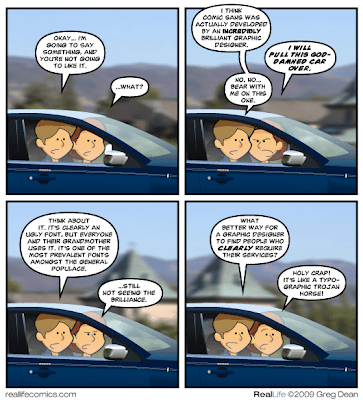
5) Using every font under the sun doesn't show you're diverse! Choose no more than two complementary fonts for the whole design (in addition to your logo) and stick to them. Using lots of typefaces looks amateur and cluttered. If you need to draw attention to certain points, make use of bold versions or increase the font size. Oh, and Comic Sans does not make you look like 'a friendly company'... (www.bancomicsans.com)
6) "Paint the whole world with a Rainbow"... just not on your literature!** Again, choose a palette of complementary colours (and not too many of them) and stick to them, preferably every time you produce a design so that each piece becomes recognisable as being from your company. Oh, and making each sentence/letter a different colour smacks of a well known 80's kid's show....
7) Invest in professional design! To see a great example of how design can be improved with professional input, take a look at one of my previous articles - We love to design... How we helped improve a DIY design.
I hope these insights prove useful to your business and if you think we can help you to improve your marketing, you know where to find us. Happy designing!
Sarah
* Yes, for the purposes of my own amusement, I am indeed nicking images off Google. This isn't design for print though....
** For anyone who's spotted that printing.com does indeed use rainbow colours on their literature, I'd argue that we're accomplished enough in design to use these in the right way. So there.
Subscribe to:
Post Comments (Atom)


No comments:
Post a Comment
What do you think? Anything to add? I'd love to hear from you. And if you like my blog, I'd really appreciate it if you'd share it on Twitter or Google+ it.